World Carbon Emissions Summary
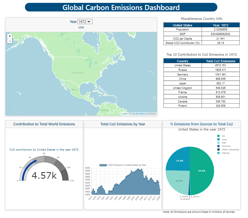
Via an available GitHub dataset, a visualization dashbaord was created utilizing Javascript, D3, Plotly, and charts.JS. The visualization dashbaord allows the user to utilize the map as seen in the image below to select a country within the map. When a country is selected, all of the respective tables and charts will update. In addition, the dropdown allows the user to select any specific year ranging from 1972 to 2020. Selecting a new year will also update all the respective charts. In the background there were several tools used:
- Pandas - used to combine/clean data from the data source. The revised data is then loaded to a PostgreSQL database
- Flask Server/app.py - used to connect our webpage to our PostgreSQL database.
- HTML/CSS - used to layout and style the website including a Bootstrap style grid.
- Javascript/Plotly/D3/Leaflet/Chart.Js - all used to retrieve the data out of the database that the flask server connects to and create the visualizations.
Preview